How to Create Custom SelectBox in React Native?
Dec 15, 2022 . Admin

In this tutorial, we will use react native library in this react native app. we will create to common file for the customer dropdown and then use to app.js file.you can at the time you select the dropdown.
In this example, we will create to a custom dropdown in react native.you can list to dropdown display in the model.you can easily nad simply create to a dropdown in react native.
Step 1: Download ProjectIn the first step run the following command to create a project.
expo init ExampleAppStep 2: App.js
In this step, You will open the App.js file and put in the code.
import { StatusBar } from 'expo-status-bar';
import { ScrollView, StyleSheet, Text, TextInput, TouchableOpacity, View } from 'react-native';
import { firebase } from './config';
import DropDown from './DropDown';
import React from 'react';
import Model from './Model';

export default function App() {

  const [option, setOption] = React.useState(false);
  const [modalVisible, setModalVisible] = React.useState(false);
  const [selectValue, setSelectValue] = React.useState('');
  const [selectId, setSelectId] = React.useState('');

  const data = [
    {
      id: 1,
      name: 'Gujarat'
    },
    {
      id: 2,
      name: 'Andhra Pradesh'
    },
    {
      id: 3,
      name: 'Haryana'
    },
    {
      id: 4,
      name: 'Manipur'
    },
    {
      id: 5,
      name: 'Sikkim'
    },
    {
      id: 6,
      name: 'Assam'
    },
    {
      id: 7,
      name: 'Bihar'
    },
    {
      id: 8,
      name: 'Goa'
    },
    {
      id: 9,
      name: 'Maharashtra'
    },
    {
      id: 10,
      name: 'Jammu'
    },
  ];

  const selectItem = (item) => {
    setSelectValue(item.item.name)
    setSelectId(item.item.id)
  }

  const renderItem = (item) => (
    <ScrollView>
      <View style={{
        backgroundColor: item.item.id == selectId ? "blue" : 'white',
        padding: 8,
        borderRadius: 18,
      }}>
        <TouchableOpacity
          onPress={() => selectItem(item)}
        >
          <Text style={{
            fontSize: 15,
            color: item.item.id == selectId ? "white" : 'black',
          }}
          >
            {item.item.name}
          </Text>
        </TouchableOpacity>
      </View>
    </ScrollView>
  );

  const selectOption = () => {
    setOption(!option)
    setModalVisible(true)
  }

  return (
    <View style={styles.container}>
      <Model
        modalVisible={modalVisible}
        setModalVisible={() => setModalVisible(false)}
        data={data}
        renderItem={renderItem}
      >
      </Model>

      <DropDown
        selectOption={selectOption}
        option={option}
        selectValue={selectValue}
      >
      </DropDown>
      <StatusBar style="auto" />
    </View>
  );
}

const styles = StyleSheet.create({
  container: {
    flex: 1,
    justifyContent: 'center',
    margin: 15
  },
});
Step 2: DropDown.js
In this step, You will open the DropDown.js file and put the code.
import { StyleSheet, Text, TouchableOpacity, View, Image } from 'react-native'
import React from 'react'

const DropDown = ({
    selectOption,
    option,
    selectValue
}) => {

    return (
        <View>
            <View style={{
                backgroundColor: 'blue',
                alignSelf: 'flex-start',
                height: 65,
                paddingHorizontal: 16,
                paddingVertical: 10,
                borderTopLeftRadius: 20,
                borderTopRightRadius: 20,
                marginTop: 5
            }}>
                <Text style={{ color: 'white' }}>Select State</Text>
            </View>
            <View style={{
                marginTop: -30,
                backgroundColor: 'white',
                borderRadius: 35,
            }}>
                <TouchableOpacity
                    style={{
                        borderWidth: 2,
                        paddingHorizontal: 15,
                        borderColor: 'blue',
                        borderRadius: 35,
                        flexDirection: 'row',
                        justifyContent: 'space-between',
                        alignItems: 'center'
                    }}
                    onPress={selectOption}
                >
                    <Text style={{ fontSize: 20 }}>{selectValue ? selectValue : 'Choose State'}</Text>
                    <Image
                        source={require('./assets/arrow_drop_down.png')}
                        style={{
                            transform: [{ rotate: option ? "0deg" : "180deg" }],
                            tintColor: 'blue'
                        }}
                    />
                </TouchableOpacity>
            </View>
        </View>
    )
}

export default DropDown
Step 2: Model.js
In this step, You will open the Model.js file and put the code.
import React, { useState } from "react";
import { Alert, Modal, StyleSheet, Text, Pressable, View, FlatList } from "react-native";

const Model = ({
    modalVisible,
    setModalVisible,
    data,
    renderItem,
}) => {

    return (
        <Modal
            animationType="slide"
            transparent={true}
            visible={modalVisible}
            onRequestClose={() => {
                Alert.alert("Modal has been closed.");
                setModalVisible
            }}
        >
            <View style={styles.modalView}>
                <View style={{
                    backgroundColor: "blue",
                    padding:10,
                    alignItems:'center',
                    marginBottom:10
                }}>
                    <Text style={{ color:'white',fontWeight:'bold', fontSize:20 }}>Select State</Text>
                </View>
                <FlatList
                    data={data}
                    renderItem={renderItem}
                    keyExtractor={item => item.id}
                >
                </FlatList>
                <Pressable
                    style={[styles.button, styles.buttonClose]}
                    onPress={setModalVisible}
                >
                    <Text style={styles.textStyle}>ok</Text>
                </Pressable>
            </View>
        </Modal >
    )
}

const styles = StyleSheet.create({
    centeredView: {
        flex: 1,
        justifyContent: "center",
        alignItems: "center",
        marginTop: 22
    },
    modalView: {
        margin: 20,
        backgroundColor: "white",
        borderRadius: 20,
        padding: 35,
        shadowColor: "#000",
        shadowOffset: {
            width: 0,
            height: 2
        },
        shadowOpacity: 0.25,
        shadowRadius: 4,
        elevation: 5,
        height:500,
    },
    button: {
        borderRadius: 20,
        padding: 10,
        elevation: 2,
        marginTop:20
    },
    buttonOpen: {
        backgroundColor: "#F194FF",
    },
    buttonClose: {
        backgroundColor: "blue",
    },
    textStyle: {
        color: "white",
        fontWeight: "bold",
        textAlign: "center"
    },
    modalText: {
        marginBottom: 15,
        textAlign: "center"
    }
});

export default Model
Step 3: Run Project
In the last step run your project using the below command.
expo start
You can QR code scan in Expo Go Application on mobile.
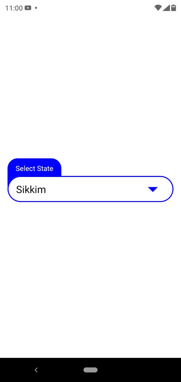
Output:
It will help you...